G-Star RAW e-commerce
Two years as Lead UX Designer — a fit selector for the product listing page and a full product detail page redesign.
- Client
- G-Star RAW
- Services
- UX lead, UX design, UX research
- Year
- 2024
Objective
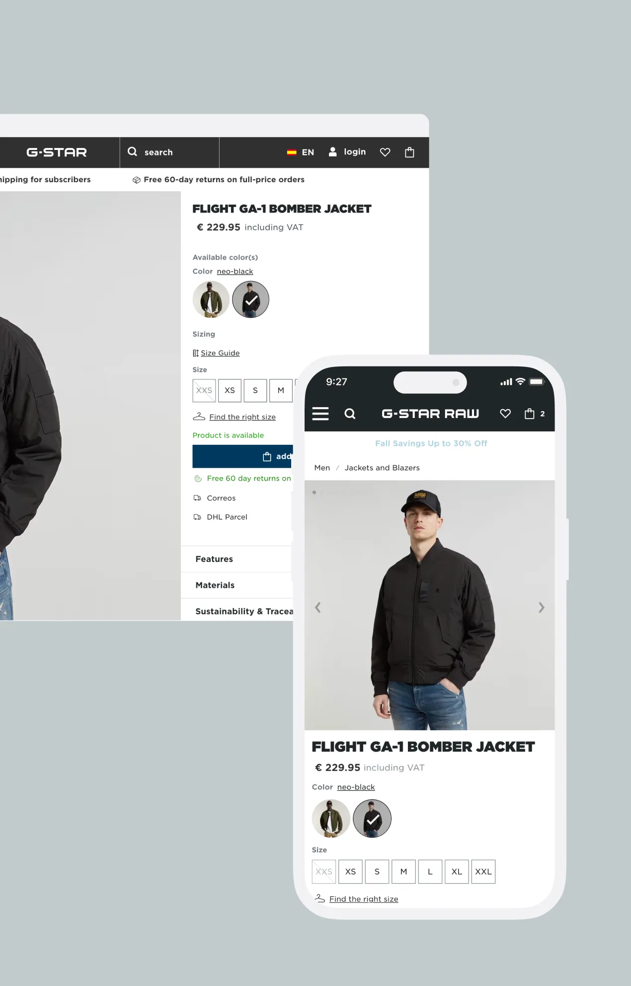
I had the pleasure of working as the Lead UX Designer for G-Star RAW over a two-year period, during which I spearheaded several key projects to elevate the brand’s digital experience. These included rebuilding the product detail page, redesigning the search experience, proposing a new homepage content strategy, conducting user research on the use of AI-generated product images, and delivering A/B tests to enhance user experience — such as replacing the traditional banner on the product listing page with an interactive slider, and reviewing the field designs on the checkout page.
Project 1: the fit selector
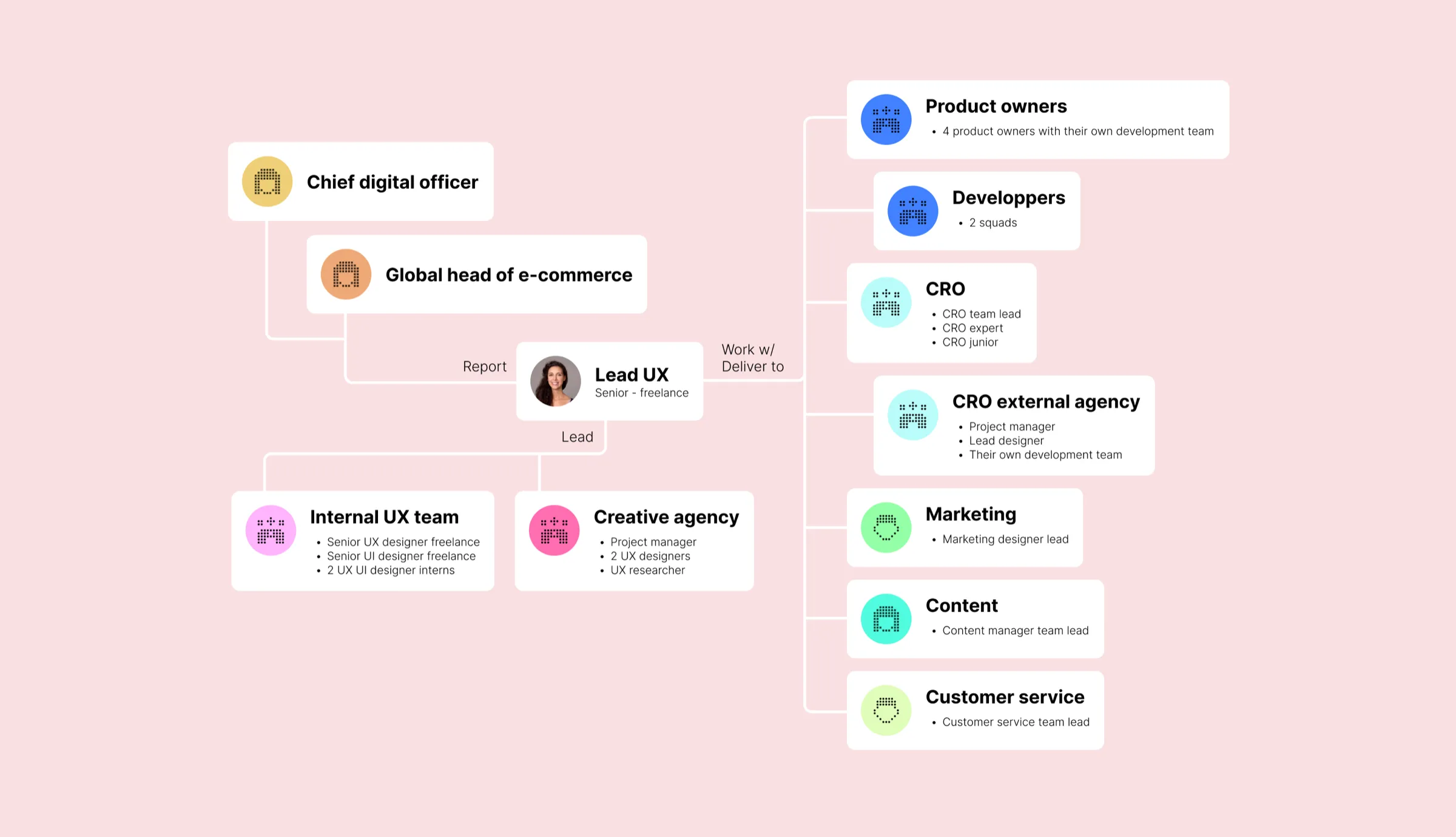
How might we increase conversions and reduce return rates by helping users select the right fit on the product listing page (PLP)?
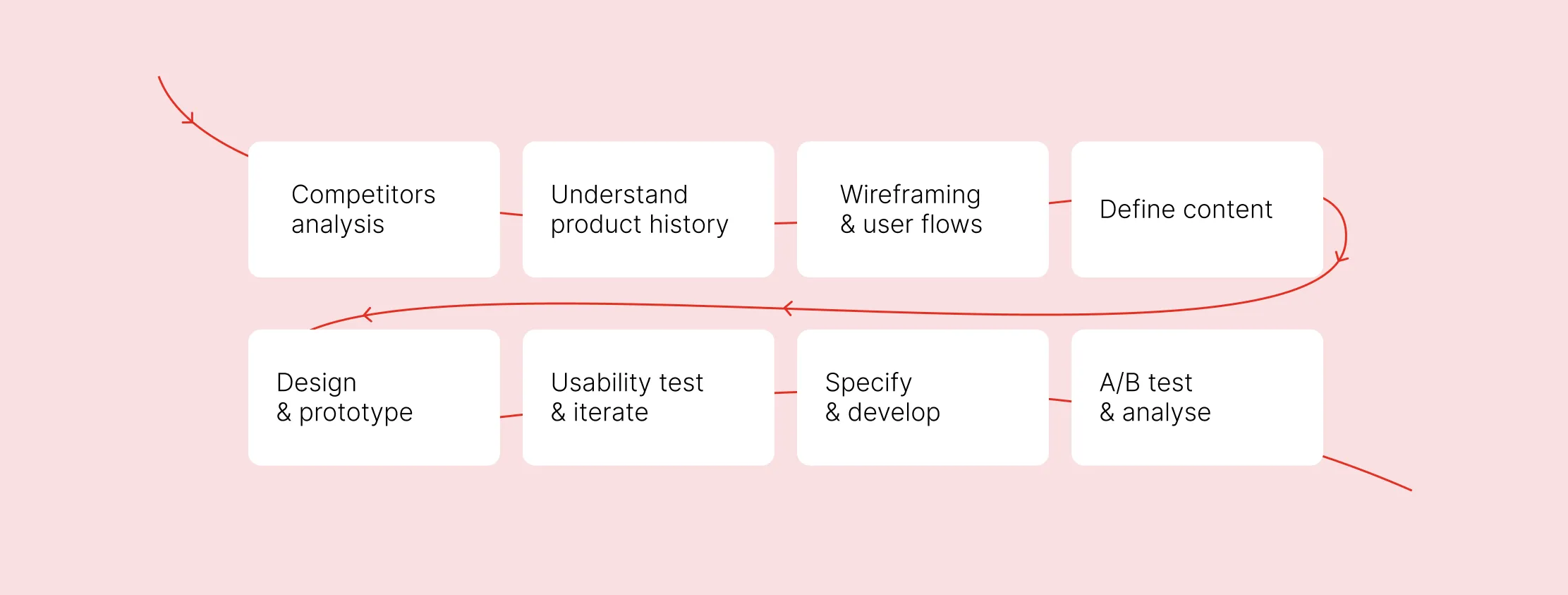
Competitor analysis
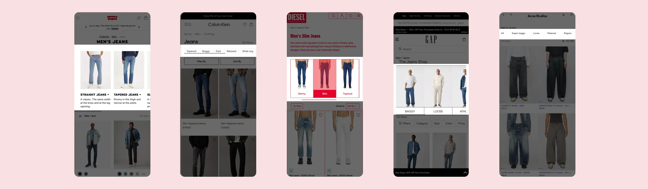
- 76% (19/25) of the competitors offer an interactive fit component, or fit selector, at the top of the PLP.
- 42% of those use only text (8/19); 58% use images (11/19).
- None of the PLPs I reviewed featured a traditional banner — a large image with text.
When I proposed to the Product Owners a visual fit selector at the top of the PLP, replacing the old banner, they told me they had already implemented a fit selector with jeans images, and that it had failed its A/B test.
Product history
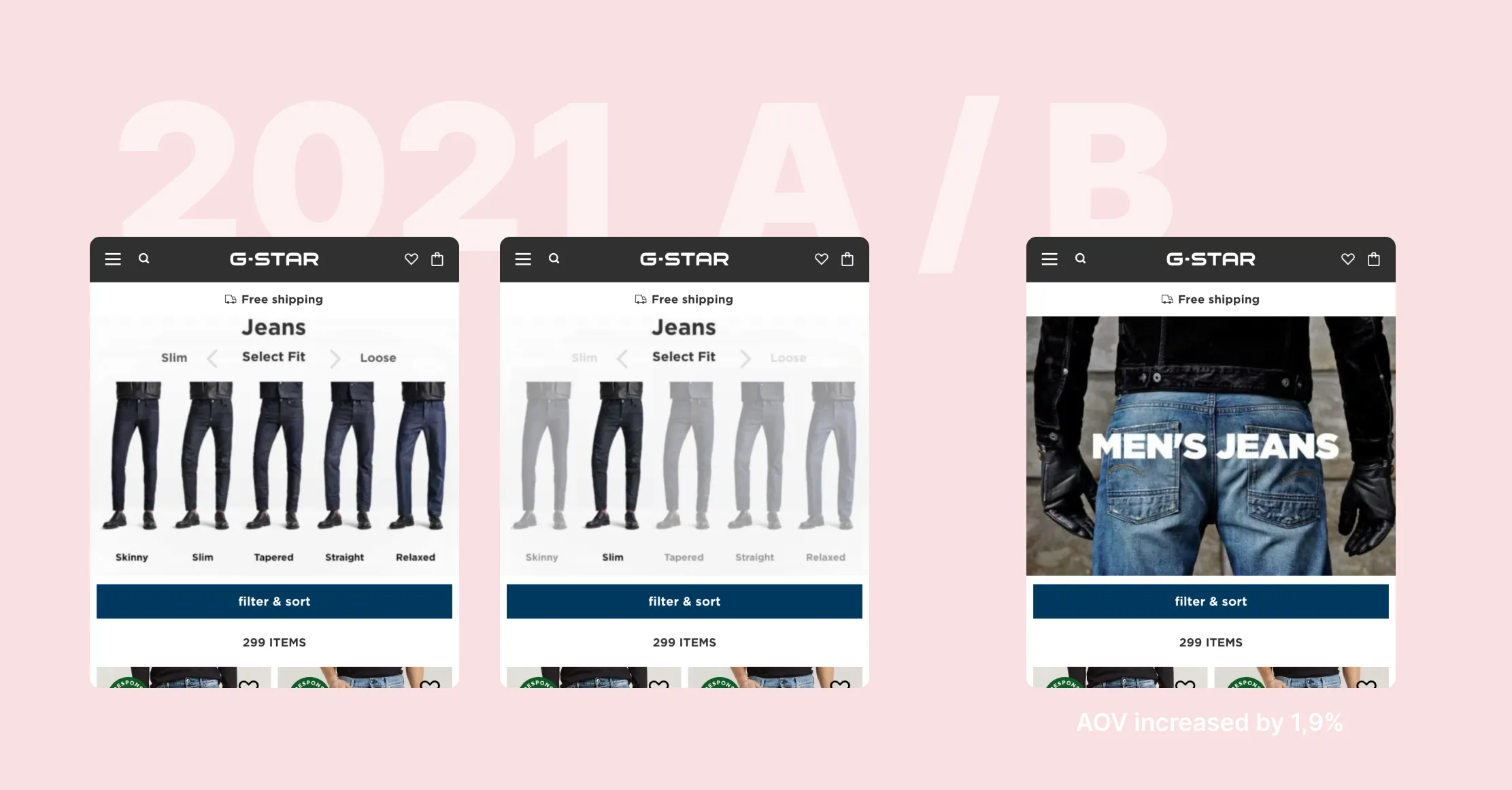
In my view, the 2021 A/B test failed due to poor design, weak interaction and an ineffective content strategy, leading to the decision to retain the traditional banner.
The jeans in the fit selector appeared too similar, and when users interacted with it, other options seemed disabled. This forced them to navigate back, rather than allowing a smooth browsing experience across different fits.
We also needed to assess whether users clearly understood the terminology used in this initial fit selector (tapered / straight / relaxed).
Wireframes & main interaction
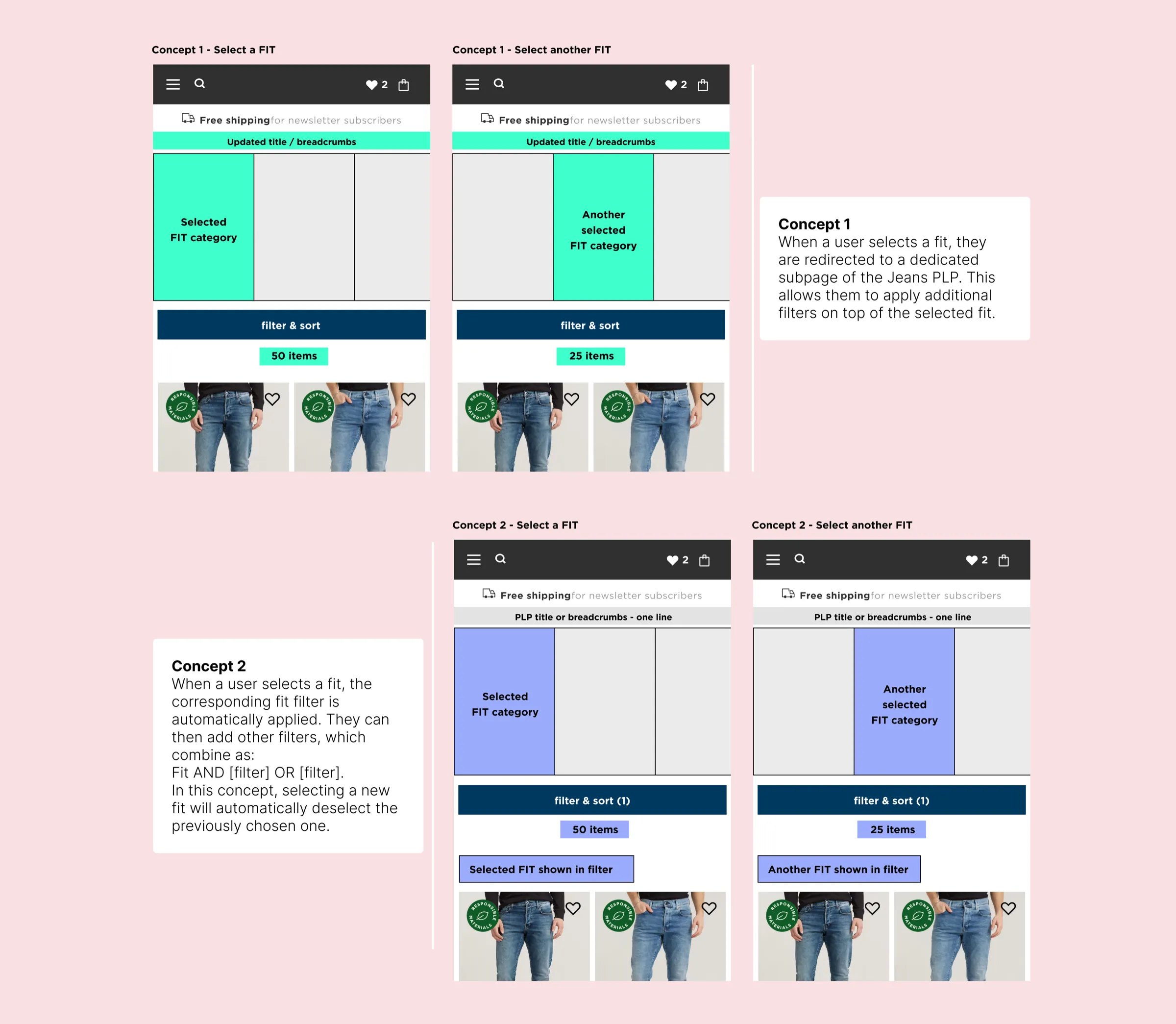
First user test
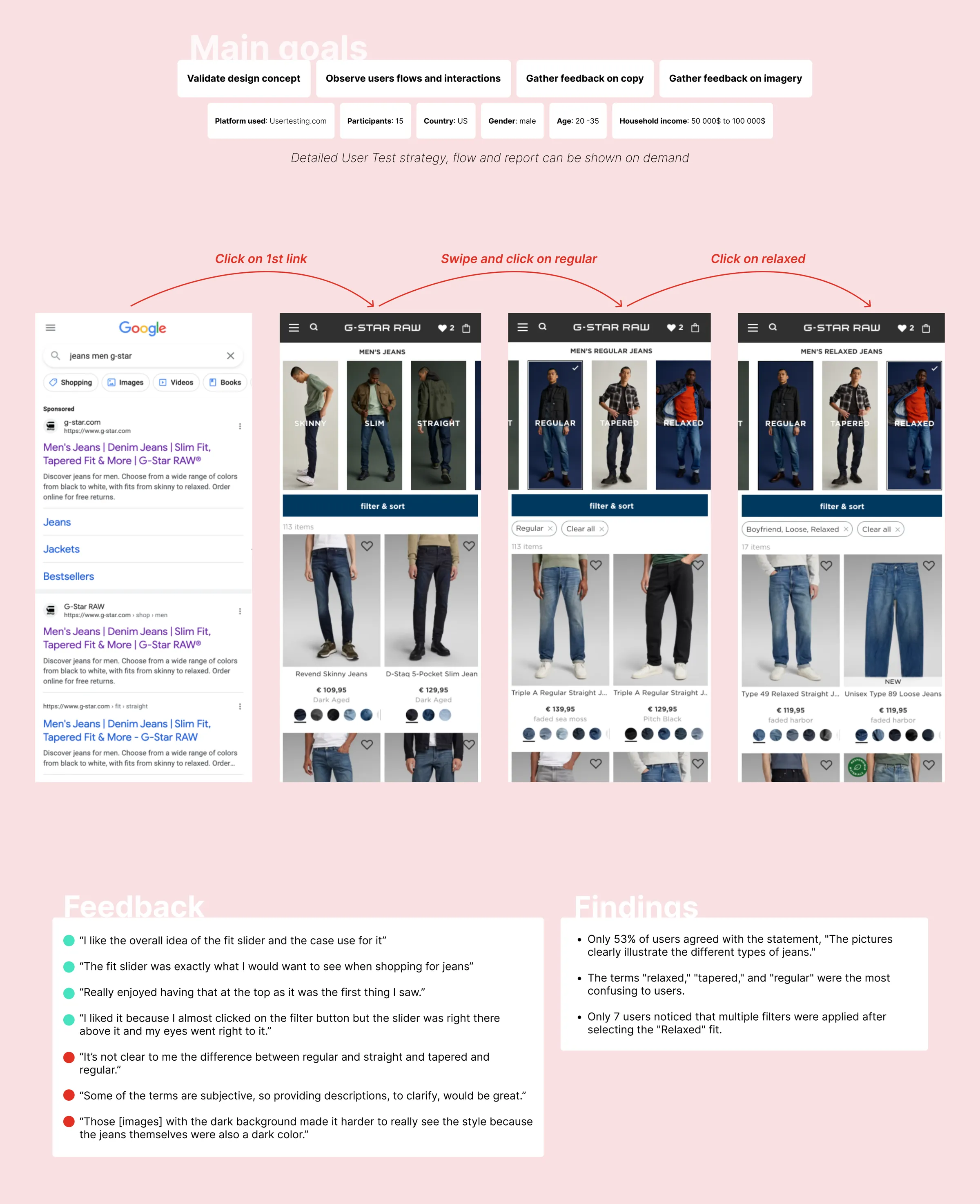
Actions
User consultations showed that some users were confused by terms like straight, regular and relaxed.
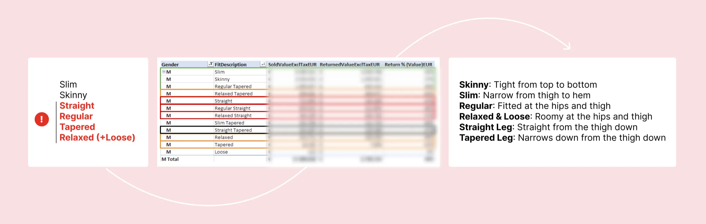
To gain further insight, I collaborated with the trade department to analyse sales and return data. This revealed that the most returned products — such as “Relaxed Straight”, “Regular Straight” and “Straight” fits — coincided with the terms users found most confusing.
Proposed solution: clearly indicate that straight and tapered refer to the leg finish, with more detailed explanations of these terms to clarify the differences.
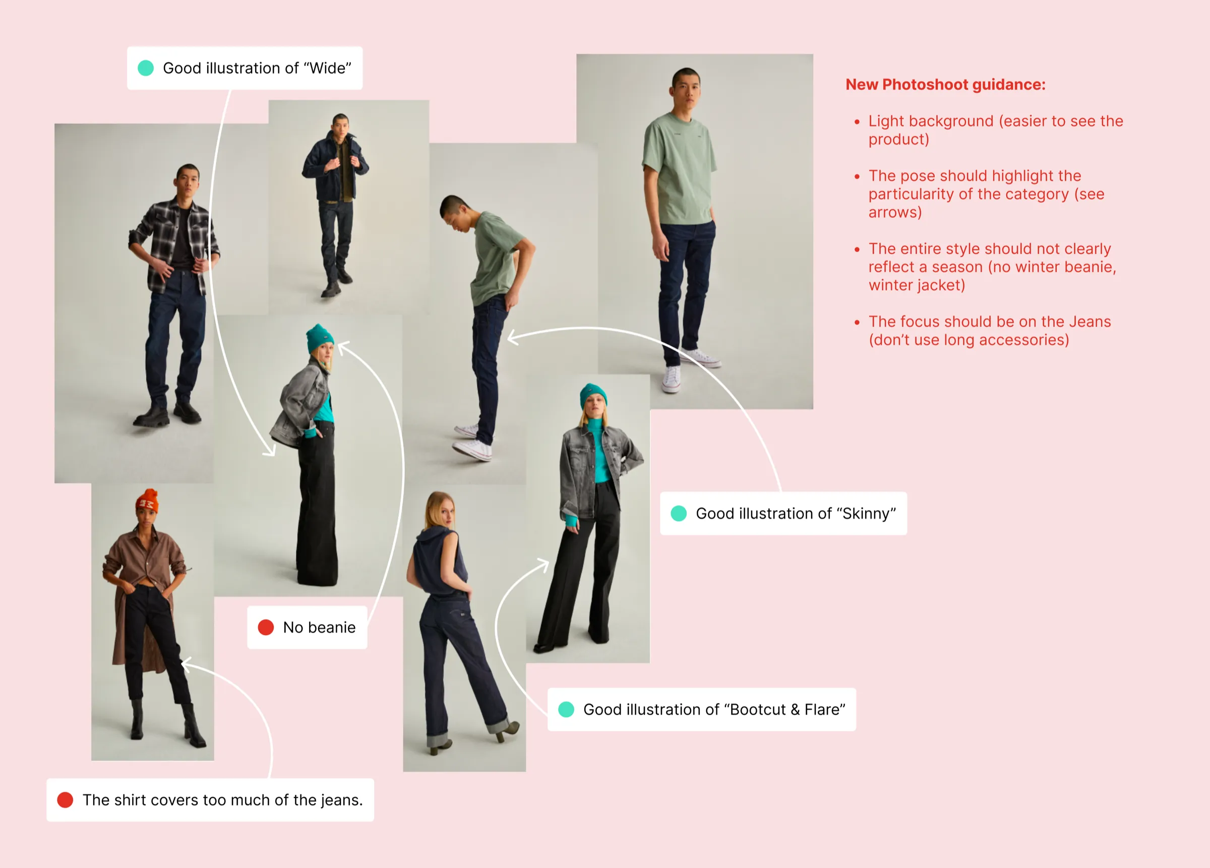
Based on user feedback, I asked the Content team for updated imagery better suited to the fit selector, clearly showcasing the specific fit of each pair of jeans.
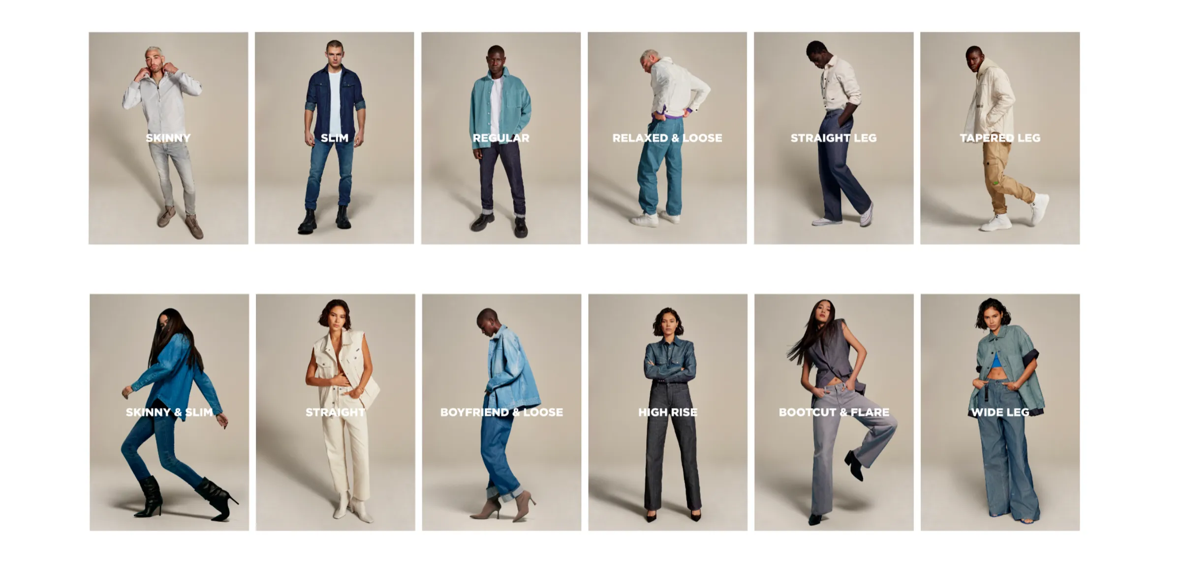
Final design
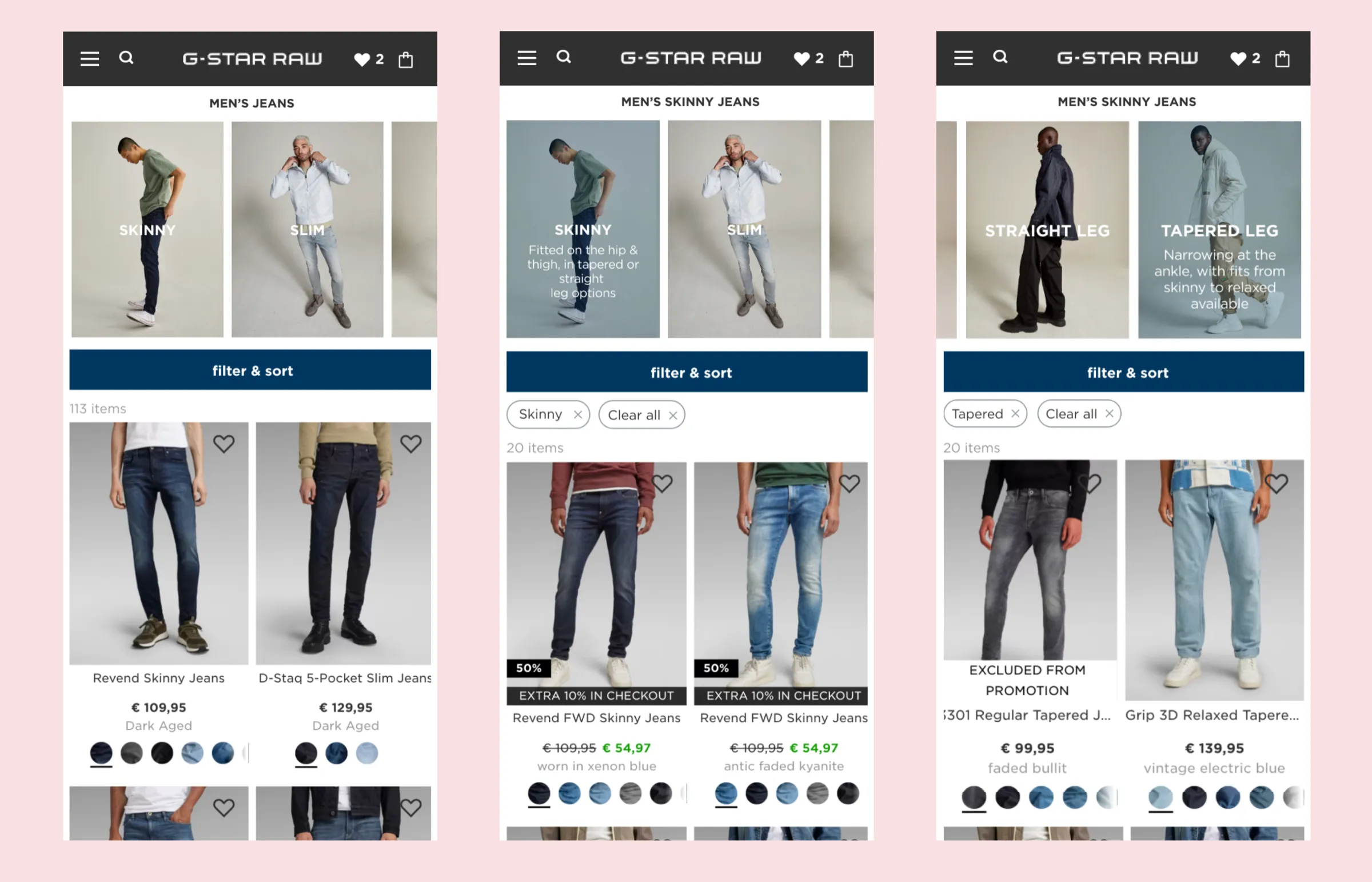
Project 2: product detail page redesign
How might we enhance the experience of the product detail page (PDP) to boost product appeal, strengthen brand image and drive sales?
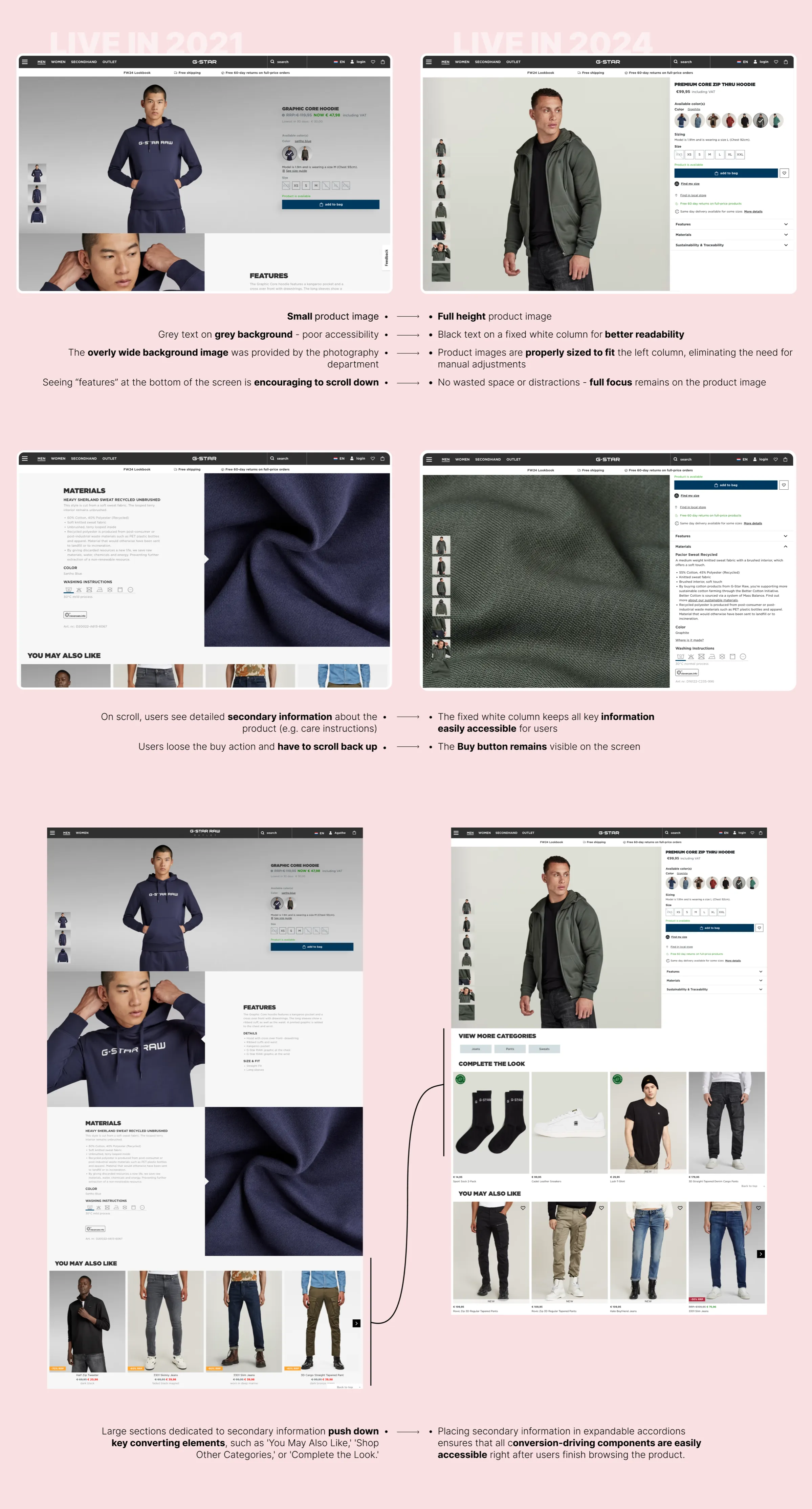
A full redesign of the PDP was undertaken to prioritise visual storytelling and product immersion. We developed a layout that gives more prominence to the imagery, with high-resolution photos showcasing intricate details of the jeans. At the same time, we introduced a fixed product info column, ensuring that critical product information (size, fit, fabric and care instructions) remains accessible as users scroll through the page. The result is both visually compelling and functionally intuitive.